Quill is the first project I created with agentic development, and it remains the project I most love to work on. In the first version of the app, I was determined that the app had to work around Gutenberg and the UI of macOS Tahoe—both of which I disliked rather intensely. However, a few things have changed, most notably the release of macOS Golden Gate, and the WordPress team has continued to improve the feel of Gutenberg in the last couple of major and minor releases.
This post covers the major improvements in the 2.0 release explaining along the way how I evolved my positions on these platforms. If you wish to skip the writeup and just download or review the new version, get it from the public Quill site.
Coming to Terms with Gutenberg
In the 7.x release line, WordPress has really evolved the Gutenberg editor. It still has a lot of the things that pushed me to create Quill: finicky controls, overly complex UI, and way more progressive disclosure than should be allowed; but I am impressed with how far it has come.
The big thing that bothered me was spending a lot of time crafting my articles in Quill, pushing to WordPress, and then being greeted with a message that the post was just one classic block. I hate workarounds that feel like hacks, and this continued to bother me more and more. Plus, the iOS app moved from the classic TinyMCE look to actually supporting basic block layouts. I also knew if I ever wanted anyone else to get excited about the app, I had to progress it to work alongside not against Gutenberg.
Quill 2.0 now handles Gutenberg compatibility seamlessly. First of all, the toolbar now creates native block compatible markup that allows it to move to and from Gutenberg seamlessly. Secondly, I decided to support a slew of additional blocks that I wanted to use in Quill: accordions, tabs, columns, pullquote, details, preformatted, separator, and buttons. In addition to supporting the base display, the Quill editor adds a secondary toolbar on blocks with additional settings such as the default tab in tabs or whether accordions autoclose. I don’t support every block or every setting, but I designed a solution for that.
I knew I could never get to a point where Quill’s editor supported every block. Instead, I decided to create the app in such a way that if it encountered a block it did not support, it simply rendered a placeholder card stating it could not be edited in the editor, and Quill would pass it safely back and forth to WordPress. However, if you’re ambitious, you can edit any block in code view and preserve it.
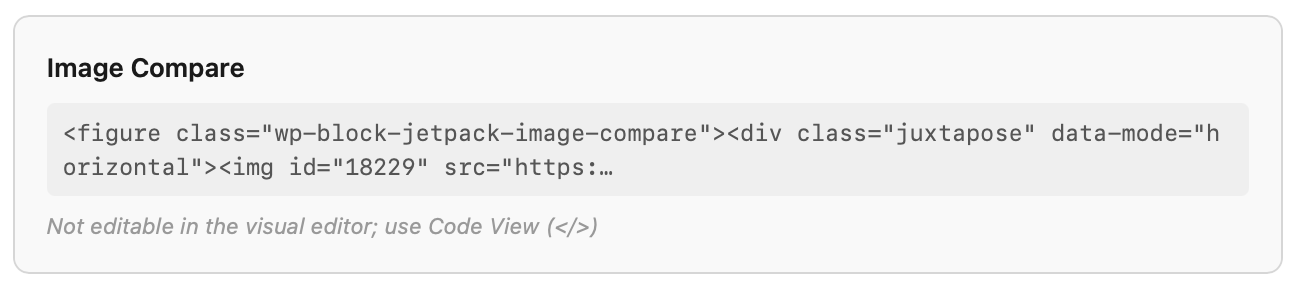
Overall, this brings a real compatibility layer with Gutenberg that I’m very proud of. I realize the blocks and the settings supported in those blocks are very opinionated, but I think I’ve covered the main things most writers will care about from the default set of blocks.
Improving the User Interface
The second thing I wanted to do was evolve the UI. I was essentially forced to roll with a lot of custom UI controls and elements because I absolutely loathed the look and feel of macOS Tahoe. Thankfully, Apple made meaningful changes to the way the OS looks and feels. I wanted to follow suit and make sure Quill felt native.1
I started by auditing and removing all custom chrome from the app. It was a lot of work, and I had to work through a lot of different issues. The result was an app that felt like a native Mac app—because it truly is. The only custom elements were parts of the metadata sidebars to support a few elements.
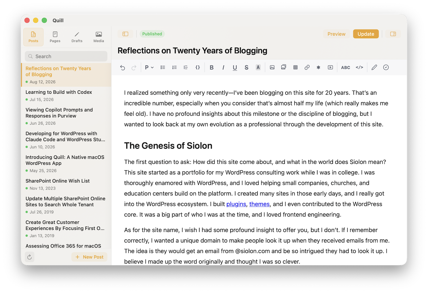
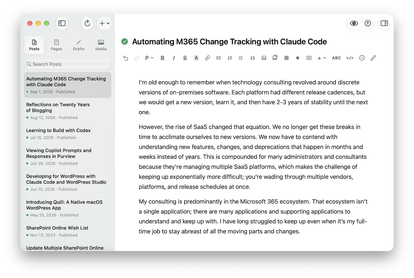
I still have gripes about the default look of macOS apps, but it became clear that the constant struggle I encountered working around it (just like Gutenberg) was no longer worth it. I was careful to make sure it looked native but had a mark of a unique identity. The app retains amber touches throughout the app, and I sneaked the logo in a few places.
Quill Now Apple Notarized
Speaking of removing anything that felt like it was hacked, I knew it was time to be serious if I wanted anyone else to take the app seriously. I had to finally get the application notarized by Apple to avoid the dreaded Gatekeeper warnings and confusing installation as a result.
I registered for the Apple Developer Program and had it properly notarized. Now when someone installs the app there are no scary warnings, and anyone can feel confident the app at least passes Apple’s bar for a safe app. It was honestly much less painful than I was worried about, and I’m really glad the app meets this security bar.
Continuing with Claude Code
I still know next to nothing about Swift, and while it does bother me at least a little, I’ve come to terms with my vibe coder title. I haven’t written a single line of Swift in this app, but as time moves on, I’m increasingly confident in the output of these agentic coding tools to create safe, well-architected apps.
I did make a consequential shift with the 2.0 release. I moved from using Sonnet as my main coding model to Opus. The majority of the 2.0 code was created with Opus 5, which almost drove me insane with how the model performed. However, with the recent 5.5 release, I’m absolutely blown away. My defaults with Claude Code now are Opus 5.5 on high, and I sometimes go to Fable for reviews, big questions, or the occasional bug I need help with.2
I also for the first time used OpenAI’s models to run computer use to do all the manual checking that automated testing can’t cover. It found several meaningful issues, and it was able to run through almost all of the manual testing plan. Anthropic’s Opus models did a decent job with computer use, but OpenAI’s models are just better for long-running tests.
Download Quill 2.0!
Those are the major highlights of the 2.0 release. I also have a detailed changelog if you wanted to review the additional improvements and fixes (there were a lot of them).3 I’m very proud of the release, and I hope others will find joy in it as well.
- I felt the same about my other Mac app Duet. I redesigned that one as well. ↩︎
- There was one particularly UI bug that Opus, Astra, and Sol could not solve. Fable solved it in its first attempt. ↩︎
- I also did some refinement on that public Quill site with Claude Design, and I gave it a proper URL. ↩︎
Comments (0)